What progress was made with the uninsured between 2013 and 2014? Use the new SHADAC interactive map to compare the characteristics of the uninsured across the United States in 2013 and 2014. The map displays data from the recently released American Community Survey to compare both years of sub-state level data--i.e., by Census Region, or Public Use Microdata Area (PUMA).
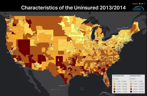
By moving the slider bar across the screen, users can view the change in uninsurance rates within the Census Regions. Clicking on a given Region allows users to access further detail on the characteristics of the region’s uninsured, including income, educational attainment, race, ethnicity, and nativity status.
Application - Comparisons Within States
Affordable Care Act related health insurance gains are important to states and local communities working to continue to make improvements in the uninsured rates in their regions. This map is a quick reference point for how uninsurance characteristics and rates changed at the sub-state level. A recent SHADAC analysis shows how coverage has changed, and points out how these uninsured populations are becoming more difficult to reach. This tool will be an asset for community enrollment navigators and assisters in helping to identify and enroll the remaining uninsured during the current Open Enrollment Period.