The following content is cross-posted from State Health and Value Strategies. It was first published on April 9, 2020.
Authors: Emily Zylla and Lacey Hartman, SHADAC
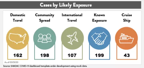
Accurate, timely data is a key tool in states’ efforts to understand and respond to the impact of the coronavirus (COVID-19) outbreak at the local level. There have also been increasing calls to further break down COVID-19 data into subcategories (such as by gender, age, and race and ethnicity) in order to track the impact of the disease on specific populations. As of April 6, all 50 states and DC are publicly reporting some type of data related to COVID-19, such as the number of positive tests and/or the number of deaths. Furthermore, some states have recently begun to utilize innovative dashboards in order to visualize and track reported cases of coronavirus disease as well as monitor additional related key indicators. These dashboards are designed to organize complex data in an easy-to-digest visual format, allowing the audience to easily interpret key trends and patterns at a glance (e.g., see SHADAC’s COVID-19 dashboard template, which is currently under development using mock data).
Source: SHADAC COVID-19 dashboard template under development using mock data.
This expert perspective reviews the key indicators currently being tracked by states via their COVID-19 dashboards and also provides an overview of “best practices” states can consider when developing or modifying these same COVID-19 dashboards.
| States that currently publish COVID-19 dashboards include: |
|
| Alabama | Montana |
| Alaska | Nebraska |
| Arizona | Nevada |
| Arkansas | New Jersey |
| California | North Carolina |
| Colorado | North Dakota |
| Delaware | Ohio |
| Florida | Oregon |
| Idaho | South Carolina |
| Indiana | Texas |
| Iowa | Utah |
| Kansas | Virginia |
| Louisiana | Washington |
| Maryland | West Virginia |
| Minnesota | Wyoming |
| Missouri | |
Current Status of COVID-19 Dashboards
As of April 6, we identified 31 states with public-facing COVID-19 data dashboards (i.e., the information is displayed with charts and other graphics, not just in tabular form), and we anticipate that more states will publish COVID-19 dashboards in the coming days.
States are reporting a wide number (ranging from 4 to 13) and type of indicators in their dashboards, most of which are updated at least daily.
Many states are also starting to show trends in these data points over time. The most common indicators reported on a state dashboard include:
- Number of total cases
- Number of total deaths
- Number of cases by county
- Map of cases by county
- Number of tests completed
- Number of cases by age group
- Number of cases by gender
- Number of deaths by county
- Number of hospitalizations
Other key indicators that some states are reporting that may be of interest include:
- Total number of recovered cases (i.e., cases that are no longer required to isolate)
- Number of hospitalizations that require ventilation
- Number of deaths by age/gender/race/ethnicity
- Case rate per 100,000 people by county
- Number of cases by race/ethnicity
- Number of cases by congregate living setting (e.g., long-term care, assisted living, dorms, jails, correctional settings, etc.)
- Number of tests completed by laboratory type (e.g., public vs. commercial labs)
- Number of tests completed by race/ethnicity
- Number of calls to a state’s COVID-19 hotline or number of hits on a COVID-19 website
It is important to note that states may be defining indicators that appear initially similar in different ways. For example, some states report “hospitalizations” as the total number of cases who have ever been hospitalized, while other states report “hospitalizations” as the current number of hospitalizations on a certain day. As a result, users should be cautious about making comparisons across states. In most cases, states have not identified the sources of their dashboard data beyond indicating that data is maintained by the respective state’s health department (or equivalent) and that it comes from a variety of sources such as state and local public health surveillance data, lab data (including public health, hospital, and commercial labs), and hospital reporting systems, among others. While the quality of the data being reported is difficult to assess currently (and is therefore reported as provisional), many states have acknowledged that data on confirmed cases represent an undercount due to a lack of widespread testing. Similarly, states have suggested that data on the number of deaths from COVID-19 may also change as post-mortem testing expands and guidance on how to record COVID-19 deaths is established. As mentioned below, we encourage states to include information on data quality, such as levels of missing data, where possible.
COVID-19 Dashboard Best Practices
Audience: Before designing a dashboard, make sure to clearly identify who is the intended audience. Different levels of detail, explanation, or source information may be necessary depending on whether the intended audience is state agency leadership, political leadership, or the general public. It is also important to think about what medium you will be using to reach the audience. Will the dashboard only be published on a website? Will it be available on a mobile device? Or, might you want to print it as a handout or post it on social media?
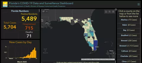
Organization and layout: Prioritize key measures. Because timeliness of these data is so important, the dashboard needs to have enough data points to convey key information, but limited enough to update quickly. It is helpful to have a landing page that makes all indicators visible to users with limited scrolling, but also provides users with the ability to “drill down” to more detail—comparisons, methodology, etc. If it is not possible to show all indicators, there should be an obvious and intuitive option for the user to “hover” over a list and get an “at a glance” view of the available content. The following example shows Florida’s COVID-19 Dashboard landing page, which implements many of these best practices.
Source: Florida COVID-19 Data and Surveillance Dashboard. Accessed March 30, 2020.
Think about any potential layout in terms of a story. It is helpful to group indicators into high-level categories with headings (e.g., overview, demographics, hospitalizations, etc.). This provides additional context for interpreting the data without the need for lengthy text descriptions. In addition, many dashboards are modular in nature so that visual elements can be replaced as information relevancy changes over time (e.g., information on likely source of exposure may become less relevant over time, while information on health care workforce exposure may become more relevant).
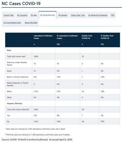
Health equity: In order to understand the potentially disproportionate impact COVID-19 may have on communities of color, low-income, and other populations that face health disparities, it will be important for states to track both COVID-19 related cases and health outcome data disaggregated for key subpopulations, such as gender, race and ethnicity, geography (e.g., urban vs. rural), and insurance status. Several states are reporting data by race/ethnicity, which is critical as early reports suggest that the crisis is disproportionately impacting communities of color. For states that do report data on race, we recommend including detail about the scope of the missing data (and the reason, if possible) to help users interpret the findings. In the example below, North Carolina’s dashboard reports confirmed cases and deaths broken down by race and ethnicity. North Carolina also clearly states the data’s limitations—i.e., the number of cases for which race and ethnicity data are missing.
Another breakdown important for monitoring equity is geography. Nearly all states are reporting data at the county level. It may also be helpful for states to present information that compares metrics in urban versus rural areas, as the unique challenges of the virus (e.g., overcrowding in densely populated areas vs. more limited hospital resources in rural areas) differ significantly by these factors. There are several approaches to defining urban versus rural areas and each have advantages and disadvantages, but given that states are already collecting COVID-19 information at the county level, it may be most straightforward to disaggregate information using the Census definition that classifies counties as “completely rural”, “mostly rural”, and “mostly urban”.
In addition to providing data by race and geography, it would be ideal if states could provide additional subpopulation breakdowns such as primary language, socioeconomic status (e.g., education, income, occupation), and disability status, if the data is available. Due to the rapid emergency response required to address the COVID-19 outbreak, we realize states may not initially have the time or bandwidth to produce a broad range of subpopulation analysis or to conduct additional analyses of their demographic data, such as looking at the intersectionality of data (e.g., by race and gender). However, those types of analyses will be increasingly important as states seek to understand disparities in COVID-19 treatment access, morbidity, and mortality.
Date and time-stamps: Because these indicators are subject to change so rapidly, it will be important to date and time-stamp any dashboard updates. In addition to date-stamping the entire dashboard, also consider adding the date (and source information) to any graphic that could potentially be used as a stand-alone item in another report or on social media. For example, the graphic below represents the age distribution of a state’s COVID-19 cases and is labeled “As of 3/31/2020” so that it’s clear what time period this represents, even when the image is viewed separately from the overall dashboard.
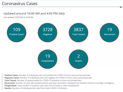
| Data labels, definitions, and sources: Provide clear data labels and documentation. Although you should avoid “cluttering” a dashboard with extensive text, it is also important to provide the audience with information about data definitions and sources. Below is an example from North Dakota’s data dashboard showing how they included definitions for each of their six key indicators below their visualization. If space is limited, it is fine to provide hyperlinks to more detailed information on these factors. However, the links should be tested regularly to ensure they are still “live” and taking users to the correct information. Source: North Dakota COVID-19 Dashboard. Accessed March 30, 2020. |
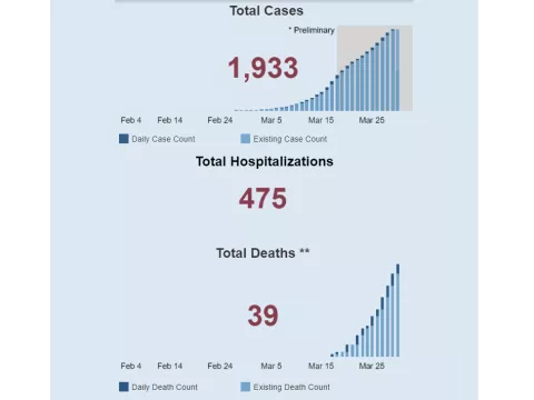
Time-series data: Visually displaying time-series data is an effective way to track changes. In order to improve readability, try to ensure that all time-trended data on the dashboard starts with the same date and covers the same time period, if possible. For example, although deaths and hospitalizations began ramping up at different times, these two time-trended graphs on Ohio’s dashboard start on the same date and cover the same time period. States may also choose to have a dual-axis marking both the date and the week (as shown in the first figure at the top of the page). This helps users understand the broader context of the trends being displayed. Source: State of Ohio COVD-19 Dashboard. Accessed March 30, 2020. |
Visualizations: Choose visualizations that are clean and compliant with a range of browsers. Simple visualizations can also help users interpret more complex data “at a glance.” For example, many dashboards use up or down arrows to indicate whether most recent data show improvements or declines. Make sure visualizations require limited manual data manipulation. For example, the visual to the right was created so that it links to a back-end Excel spreadsheet, which is easily refreshed.
Documentation to support data updates: After constructing your customized dashboard, create an “instruction sheet” outlining all of the steps necessary to update the data on an ongoing basis, including:
- Which specific cells or inputs need daily updates
- What data sources are being used and where the data is located
- How and where to document what data was pulled and when
This detailed “instruction sheet” is especially important in the event that the individual who normally updates the data is absent or leaves—that way someone else can easily complete the update.
Support for the development of this expert perspective was provided by the Robert Wood Johnson Foundation. The views expressed here do not necessarily reflect the views of the Foundation.


